
Honey Do Men: Sales Team Welcome Folders
I had the opportunity to create exclusive clothing designs for the Rensselaer Crew Club (RPI Crew Club). The goal was to design apparel that reflected the team's identity, spirit, and legacy while ensuring a modern and wearable aesthetic.
Objective:
Develop visually striking designs that align with RPI Crew Club's branding.
Create apparel that enhances team unity and school pride.
Ensure designs are functional, comfortable, and appealing to both rowers and supporters.
Incorporate modern typography, bold graphics, and RPI’s signature colors.
Design Process
1. Understanding the Brand & Sales Process
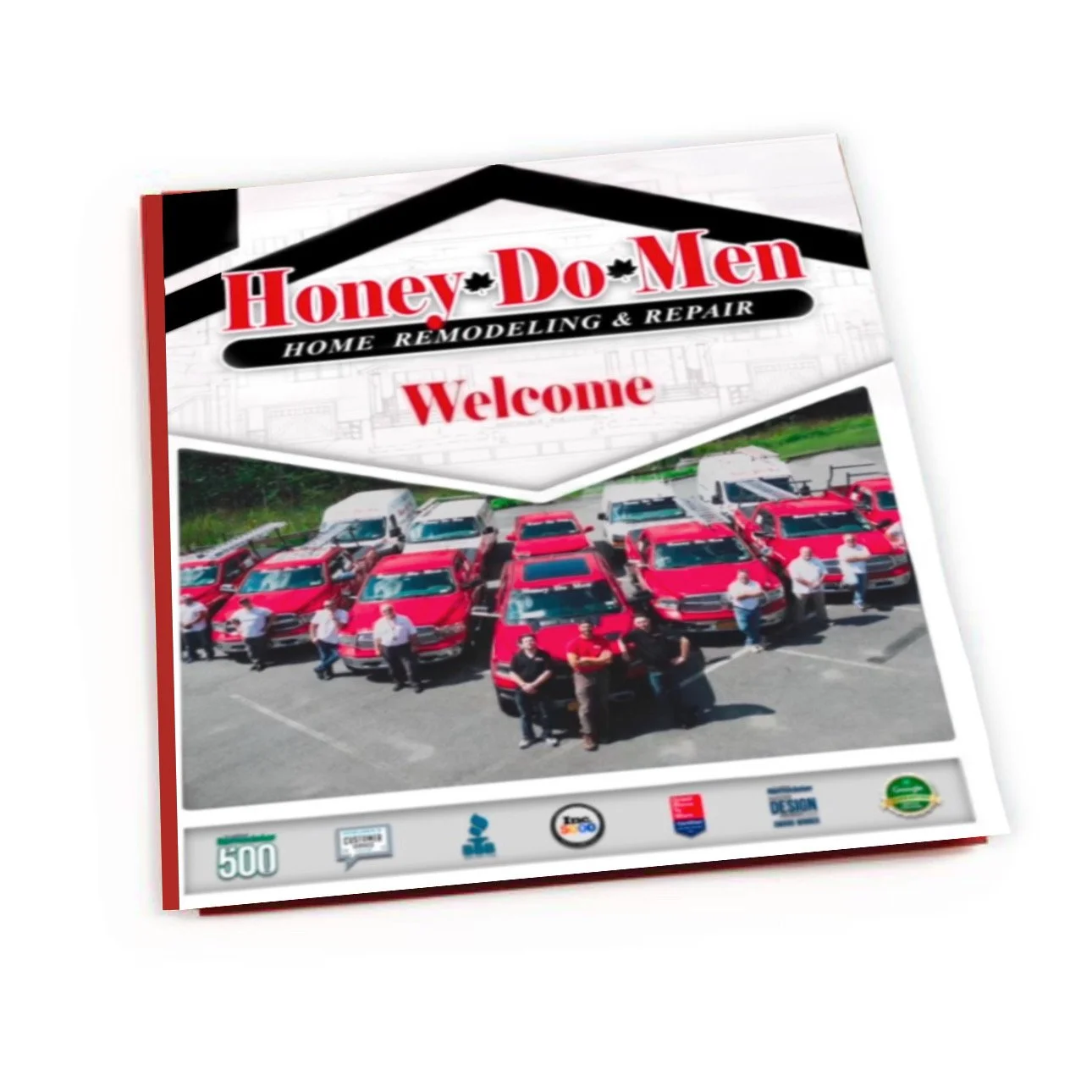
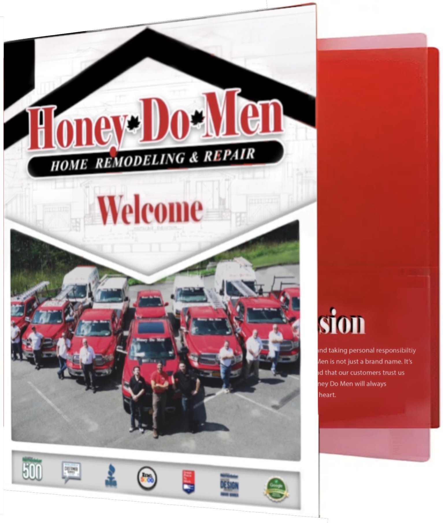
Before beginning the design, I familiarized myself with Honey Do Men’s branding guidelines, company mission, and sales approach. This helped ensure the folders reinforced brand identity while being functional and informative for the team.
2. Layout & Content Organization
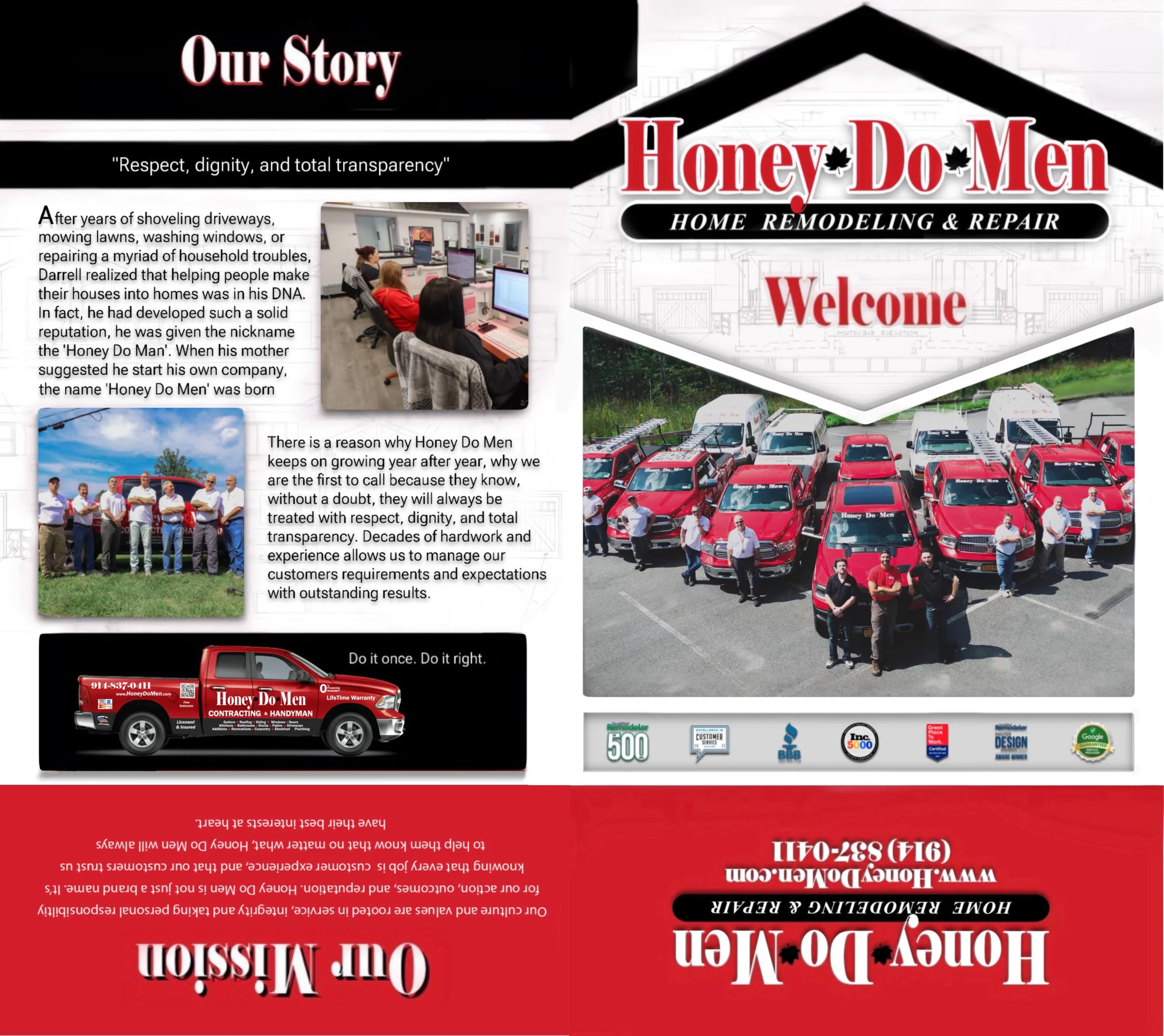
I structured the welcome folder to include:
Company Overview – Mission statement, core values, and brand story.
Sales Materials – Brochures, service offerings, pricing guides.
Lead Capture Forms – Custom-designed sheets for sales reps to collect client details.
Contact Information – Key departments and support resources.
Success Stories & Testimonials – Highlighting positive client experiences to build credibility.
3. Design Execution
Using Adobe Illustrator and InDesign, I designed a sleek and structured folder layout, incorporating:
Bold typography and cohesive color schemes that align with Honey Do Men’s branding.
High-quality images of the team and workplace
Custom iconography to simplify key messages and improve readability.
Strategic placement of content sections to facilitate easy navigation for sales reps.
4. Feedback & Refinement
After initial drafts, I collaborated with the marketing and sales teams to gather feedback. Based on their input, I refined the design by:
Adjusting font sizes for improved readability.
Enhancing color contrast to maintain visual clarity.

Key Takeaways
Effective branding enhances both internal training and external client relations.
Structuring materials in a clear, digestible format improves usability.
Collaboration with sales and marketing teams ensures materials are both visually appealing and functionally effective.
The welcome folders streamlined the onboarding process for new sales reps, giving them a clear and professional introduction to the company. Sales representatives found the folders helpful for client interactions, improving engagement and trust. The materials reinforced brand consistency and professionalism across all sales interactions. Designing these sales team welcome folders for Honey Do Men allowed me to merge UX principles with print design, ensuring that the folders were both aesthetically strong and strategically useful. This project highlights my ability to create branded materials that enhance business operations and user experience.
Outcome